10 June 2015 – TRADITION INNOVATED; INSPIRED SIMPLICITY CONVEYS QUALITY
 “The redesign of our packaging integrates our proud heritage with modern design to emphasise the brand name as a symbol of quality and to offer consistency across all our products.” Stafford Bros & Draeger’s managing director: Chris Lewis-Enright
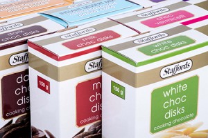
The redesign, focused on enhancing the iconic value of the distinctive and respected Staffords logo, strikingly roots the revamped logo in a band of gold reinforcing its quality heritage.
“We wanted to highlight a clear and consistent brand identity across our full range of products making them instantly recognisable to consumers even though they are vastly different,” explains Lewis-Enright. “The new packaging icon is now strategically placed on every Stafford Bros & Draeger product as a symbol of our quality guarantee, ensuring that we make the best use of the few seconds we have in the supermarket aisles to attract and hold consumers’ attention.”
Whilst keeping true to the brand’s classic origins, the new design refreshed the packaging with product shots, vibrant colour coding and usage information to widen brand recognition and to extend the quality message across all Stafford Bros & Draeger products.
“The vibrant colour palette and bold graphics are not the only design elements consumers will love,” says Lewis-Enright, “we have also included clear usage instructions to make it easy for them to choose the right product for their purpose. Our dessert range includes close-up photography for irresistible appetite appeal.”
Lewis-Enright is confident that the attention grabbing, informative designs will significantly boost the on shelf presence of Stafford Bros & Draeger products, “essential in a highly competitive marketplace,” he concludes.

